



How to Choose Bold Graphic Tees That Hit
A bold graphic tee can make you look dialed in or like you grabbed the loudest thing in the drawer with the lights off. That’s the difference most guys miss when they ask how to choose bold graphic tees. It’s not about wearing something loud for the sake of it. It’s about picking a shirt that matches your build, your standards, and what you actually stand for.
A good graphic tee should do two jobs at once. First, it needs to fit like a shirt you’d wear even if there were no print on it. Second, the design needs to say something without looking forced. If one of those fails, the whole thing falls apart.
How to Choose Bold Graphic Tees Without Looking Overdone
The first rule is simple. Let the shirt make a statement, but don’t let it wear you.
A lot of men get this backward. They chase the biggest print, the brightest color, or the most aggressive slogan and assume that equals impact. It doesn’t. Real impact comes from clarity. If the design reflects your attitude and the shirt fits right, people notice. If it looks random or theatrical, they notice that too.
Start with the message. Ask yourself what kind of statement you want to make. Patriotic. Tactical. Irreverent. Old-school Americana. Hard-charging gym energy. There’s no wrong lane if it’s honest. The mistake is buying a tee because the artwork looks intense when it has nothing to do with your actual style or values.
That matters because bold graphic tees are identity pieces. They aren’t background basics. They tell people something before you say a word. If the design feels true to you, it reads as confidence. If it feels borrowed, it reads like costume.
Fit Wins First, Graphics Second
A strong print won’t save a bad cut. If the shoulders droop, the sleeves flare, or the torso hangs like a box, the shirt is dead on arrival.
Look at the shoulder seams first. They should sit close to the edge of your shoulders, not halfway down your arm. Then check the chest and sleeves. A solid tee should skim the body, not strangle it and not drape like a poncho. On most builds, sleeves that hit around mid-bicep give the shirt a stronger silhouette and make the graphic feel more intentional.
Length matters too. Too short and the shirt looks cheap. Too long and the whole outfit starts leaning sloppy. The hem should generally fall around mid-fly. That gives you enough length to move without turning the tee into a nightshirt.
If you’re bigger through the chest, shoulders, or arms, don’t size up just to avoid cling. That often creates extra fabric at the waist and makes you look heavier. Instead, look for a better cut. If you’re leaner, avoid ultra-relaxed fits unless you’re deliberately going for a streetwear shape. Most bold tees look best when they follow the frame without swallowing it.
The Right Graphic Depends on Distance
A good design works from across the room and up close. That’s where a lot of cheap graphic tees fail.
From a distance, the shirt should have a strong read. That might be a clean emblem, a sharp block of typography, a flag treatment, a skull, a crest, or a military-inspired mark with clear contrast. Up close, the details should reward a second look. Linework, texture, distressed ink, placement, and print quality all matter.
If the design is too busy, it turns into visual static. If it’s too generic, it disappears. You want something with backbone. Clean shapes. Confident typography. Artwork that doesn’t look like it was assembled from stock clip art and fake grit.
This is where restraint matters. Bold does not always mean massive. A chest hit can be strong. A full-front print can be strong. Even a back graphic can carry the shirt if the front stays clean. It depends on how you wear it and what role you want the tee to play in the outfit.
Color Is a Weapon - Use It With Intent
When figuring out how to choose bold graphic tees, color is usually where people get either too cautious or too reckless.
Black, military green, charcoal, navy, and off-white are the easiest base colors because they carry strong graphics without fighting them. They also pair well with denim, field jackets, flannels, tactical pants, and broken-in shorts. If you want a tee that earns heavy rotation, start there.
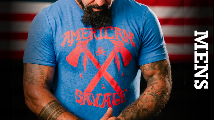
Brighter shirt colors can work, but they raise the difficulty level. A red tee with a loud print can hit hard, but only if the artwork and the rest of the outfit stay disciplined. The same goes for bright blue, yellow, or neon tones. Those colors aren’t wrong. They just leave less room for error.
Graphic color matters as much as shirt color. High-contrast prints usually read cleaner and stronger. White on black. Sand on olive. Red on heather gray. Tone-on-tone can work too, especially if you want something more understated, but subtle graphics have to rely more on quality and fit.
If your goal is maximum versatility, choose shirts in dark neutral colors with one commanding graphic element. If your goal is to make the tee the center of the outfit, let the color do more work but keep the rest of your gear simple.
Match the Tee to the Rest of Your Kit
The shirt isn’t the outfit. It’s the signal flare.
A bold graphic tee works best when the rest of what you’re wearing supports it instead of competing with it. Jeans, utility shorts, dark joggers, boots, trainers, a solid hat, and a clean overshirt all give a graphic tee room to breathe. That’s usually the winning formula.
Where guys go wrong is stacking statements. Loud tee, loud camo, flashy sneakers, oversized chain, aggressive hat slogan - now it’s all noise. Pick one lead piece. Most of the time, that should be the shirt.
There are exceptions. If your style leans rugged and tactical, a strong tee under a field jacket or heavyweight flannel can look even better than the tee alone. Layers can frame the design and toughen the overall look. Just make sure the outer layer doesn’t choke off the print or create bunching through the chest.
And think about where you’re wearing it. A gym tee can go harder on attitude and print size. A weekend cookout shirt can be more relaxed and patriotic. Something you wear under a jacket for a night out should usually be cleaner and tighter in design. Context matters. Same values, different mission.
Quality Shows Fast
A graphic tee takes abuse. Washes. Heat. Sweat. Sun. If the cotton feels flimsy or the print cracks after a few rounds in the laundry, it wasn’t worth the buy.
Pay attention to fabric weight and hand feel. A premium tee should feel substantial without wearing like armor. Softness matters, but not if it comes at the cost of structure. The best shirts hold shape through the collar, sleeves, and body while still feeling broken in enough to wear all day.
Print quality matters just as much. Good ink sits right in the sweet spot. It feels integrated into the shirt, not like a plastic slab glued on top. Distressing should look deliberate, not like poor production. After a few washes, a quality graphic should age with character, not peel into a mess.
This is one reason identity-driven brands with a real point of view tend to win. When the design actually means something and the build quality is there, the shirt feels like gear, not disposable fashion. That’s the lane Rogue American was built for.
Choose for Longevity, Not Just the First Impression
The best bold graphic tees still look right six months from now. That means avoiding designs that rely only on a joke, a trend, or shock value.
A shirt built around conviction has staying power. Patriotism, grit, service, freedom, strength, brotherhood, resilience - those ideas don’t expire when the algorithm changes. The same goes for classic iconography and clean typography. You’re better off owning fewer shirts with real edge than a pile of throwaways that lose their punch after one season.
That doesn’t mean every tee has to be dead serious. Humor, aggression, and sarcasm all have their place. Just make sure they still sound like you when the novelty wears off.
One good test is this: would you still wear the shirt if the print were smaller? If the answer is no, the design may be doing too much heavy lifting. A great graphic tee is built on fit, quality, and message. The print turns it up. It shouldn’t be the only thing keeping the shirt alive.
A bold tee should feel like a flag you chose to carry, not a costume you rented for attention. Pick one that fits hard, reads clean, and says something you’re willing to stand behind. When that part is real, the shirt doesn’t just look better - it means more.