



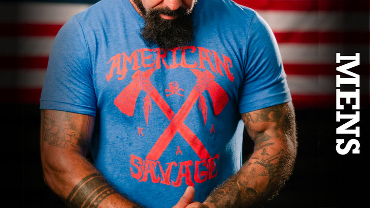
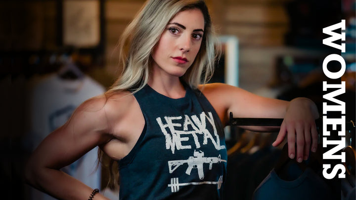
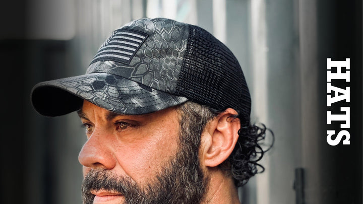
Men's Graphic Tee Review for Men Who Stand Out
A shirt can be cheap, soft, and still not be worth wearing. If the collar twists after two washes, the fit hangs like a sack, or the graphic starts peeling before the season changes, it belongs at the bottom of the drawer. This men's graphic tee review looks at what separates a throwaway shirt from one that earns its place in the rotation.
For men who train, work, serve, build, and carry themselves with purpose, a graphic tee is not background noise. It is an everyday uniform. The best ones feel right when you pull them on, hold their shape through real use, and say something without needing a speech.
What a Men's Graphic Tee Review Should Actually Judge
Most tee reviews stop at whether a design looks good in a product photo. That is the easy part. A serious review starts with the shirt itself: fabric weight, cut, collar recovery, seam quality, print durability, and whether the graphic matches the man wearing it.
A good graphic cannot rescue a bad blank. If the material is paper-thin, it can cling where it should drape and stretch out by noon. If it is overly heavy or stiff, it may survive the wash but feel miserable in heat, under gear, or during a hard training session. The right balance depends on how you live in it.
A lighter cotton blend can make sense for the gym, summer, and layered everyday wear. A heavier cotton tee generally brings more structure and a tougher hand feel, especially when worn on its own. Neither is automatically better. The question is whether the fabric supports the job you expect the shirt to do.
Fit matters just as much. A shirt that is too tight through the chest and arms can turn a strong design into costume territory. One that is too loose can look sloppy and bunch under a hoodie, plate carrier, or jacket. Look for a cut that gives the shoulders room, follows the chest without squeezing it, and falls cleanly through the torso.
Fabric, Fit, and the Test of Real Wear
The first wear tells you something. The tenth wash tells you the truth.
Start with the collar. A solid crew neck should lie flat and return to shape instead of becoming wavy or stretched. It is a small detail, but it is the first thing people notice when a shirt starts looking worn out. Reinforced seams at the shoulders and sleeves also matter because those are the areas that take constant movement and friction.
Then consider shrinkage. Cotton often changes after the first wash, particularly if it goes through high heat. That does not mean you should avoid cotton. It means you should know your size, follow the care instructions, and avoid assuming every shirt fits exactly like the last one you bought. If you are between sizes, think about your preferred fit and how you plan to dry it.
A strong tee should move with you without becoming clingy. That matters when you are lifting, hauling equipment, chasing kids, riding, or spending a long day on your feet. Comfort is not soft marketing language. It is whether you forget about the shirt because it is doing its job.
Color is part of durability, too. Black, charcoal, olive, and military-inspired earth tones are practical for hard wear and fit naturally into a no-nonsense wardrobe. They also hide the kind of marks that show up in real life. Brighter colors can work, but they need to keep their depth after repeated washing instead of fading into something tired and flat.
The Print Has to Fight for Its Place
A graphic tee lives or dies by the print. Cracked ink, fuzzy edges, and a plastic-feeling design can make an otherwise decent shirt feel disposable. A quality print should have sharp lines, strong contrast, and enough flexibility to move with the fabric.
There is a trade-off here. A large, dense print often delivers maximum visual impact, but it can feel warmer and less breathable across the chest. A smaller chest hit with a larger back graphic can feel more balanced for active wear. Placement matters as much as size. A design sitting too high can crowd the collar. Too low, and it looks like an afterthought.
The message matters even more. Generic skulls, random flags, and borrowed military imagery are everywhere. They may catch attention, but they do not always carry conviction. The better graphic tees are specific. They reflect discipline, service, liberty, grit, faith, family, or the refusal to bend to whatever trend is being pushed this week.
That does not mean every shirt needs to be loud. Sometimes a clean front graphic says more than a full-panel print trying to prove too much. Choose the level of statement that fits where you are headed. A bolder design works at the range, in the garage, at a concert, or during a weekend with your crew. A more restrained graphic may be the better call for errands, travel, or a casual work setting.
A Men's Graphic Tee Review for More Than the Mirror
The right shirt should work beyond the first look in the mirror. Ask whether it fits with the rest of your gear and wardrobe. A graphic tee that pairs with denim, shorts, boots, training shoes, a flannel, or a jacket gets worn. One that only works for a single photo ends up collecting dust.
This is where purpose-driven apparel separates itself from trend-chasing fashion. The shirt should feel connected to something you actually believe, not like a costume you borrowed for the day. Veteran-founded brands such as Rogue American Apparel understand that difference. The point is not to wear a message because it is popular. The point is to wear it because it is yours.
Value is also bigger than the sticker price. A bargain shirt that loses its shape after a handful of washes costs more per wear than a better-made tee that stays in rotation for years. That does not mean every shirt needs to be premium-weight or priced like a specialty item. It means the construction, material, graphic, and durability should justify what you pay.
When comparing tees, use a simple standard: Would you wear it on a hard day, not just a good day? Would you grab it when the laundry is low and you need something dependable? Would you still stand behind the graphic after the novelty wears off? If the answer is yes, it has passed the test that matters.
Care Is Part of the Deal
Even a well-made graphic tee needs basic discipline. Turn it inside out before washing to reduce abrasion on the print. Use cold water when possible, avoid aggressive bleach, and keep high dryer heat to a minimum. Heat is often the fastest way to fade color, weaken elastic fibers, and make ink feel brittle.
Do not confuse proper care with babying your clothes. A shirt made for real life should handle regular use. Care simply gives good material and good printing the chance to last as intended.
The Verdict: Wear Something You Mean
A strong graphic tee is not defined by how aggressive the artwork is or how many colors hit the front. It is defined by construction, fit, durability, and a message that does not need approval from the crowd. It should feel dependable, look deliberate, and remain comfortable after a full day of work or a hard session.
Pick the shirt that fits your body, your environment, and your standards. Then wear it enough to give it character. The best tee in your drawer will never be the one kept pristine for a photo. It will be the one you reach for because it still fits, still holds up, and still says exactly what you stand for.